INDUSTRY

RETAIL

CASE STUDY

CASE STUDY

YEAR

2026

EXPERIENCE

PRODUCT DESIGN

Cover
Cover
Cover

Waitrose

about

Every time I do my grocery shopping, I ask myself: how is it possible to have this endless waste of paper?

I bought three items, yet I’m handed a huge slip full of useless information. And honestly, who has ever really read a receipt? Considering 600.000 to 1.000.000 trees are used, just for receipts in UK each year.

What actually matters to me is the total, and at most knowing which barcode I need to scan to exit the store if it is needed.

Showcase image
Showcase image
Showcase image

So the first step is grouping information logically.

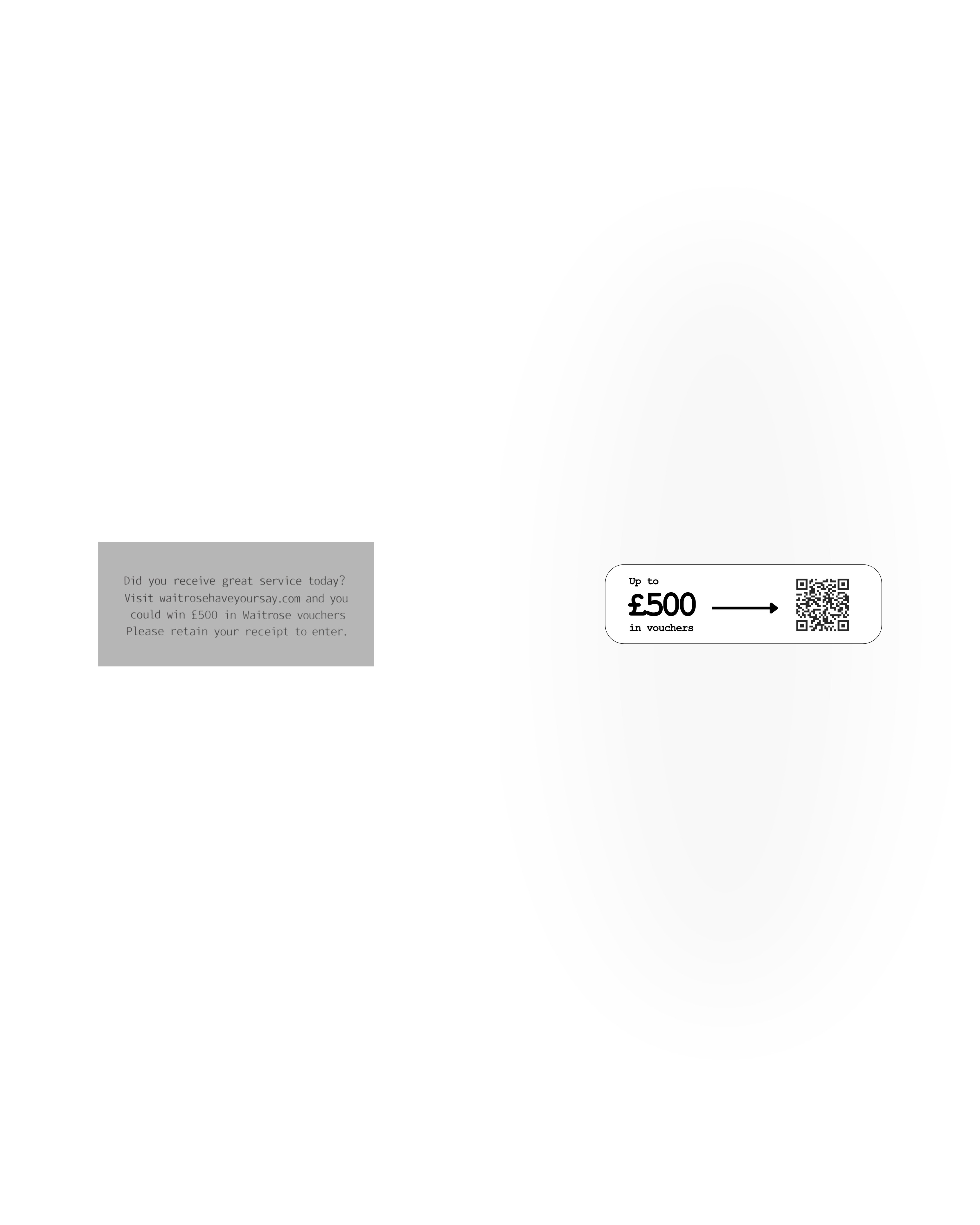
At the top we have the shopping list, here the legal information, and here the loyalty card section with points and balance. There’s also a sponsored section, which we can make clearer and more effective instead of hiding it in the noise. There’s also a sponsored section, which we can make clearer and more effective instead of hiding it in the noise.

runners

runners

The runners’ interface was designed to stay simple, intuitive, and distraction-free. For this flow, I analysed several existing running and event apps, identified the most effective interaction patterns, and combined them into a streamlined experience tailored to our users’ needs.

Next, we work on hierarchy.

We make the most important information larger and reorder elements based on what is actually useful to the user. We could even introduce a quick recap at the beginning of the receipt, showing the most relevant information such as the total amount or loyalty points.

And voilà: a completely redesigned receipt. The exact same information, but with good UX—clearer, more readable, and most importantly, shorter.

andreabonannella@gmail.com

London, United Kingdom

contact

andreabonannella@gmail.com

London, United Kingdom

contact

andreabonannella@gmail.com

contact